FileSelector
<h1>File Selector</h1>
FileSelector object; is an object that allows the upload of files on the form, in the local directory or in the Document Management System.
The process of uploading files to the object is done by clicking on the ellipsis expression located to the right of the field. One or more files can be selected.
The upload status of files selected for upload to the object can be monitored in the upper-right corner of the screen, with the user continuing to fill in other fields on the form while the file upload continues in the background.
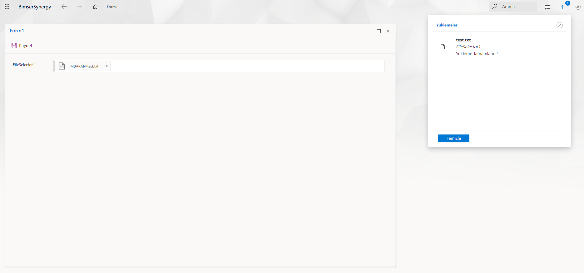
Clicking on the file loaded into the object opens the file preview screen in the side panel. Thus, the uploaded file can be viewed in the web interface.
General
Design
'Name' - The name of the object to be used by the system. Inside another object and on the code side, the object is accessed by the value written in the namespace.
Caption
'Title' - The part where the label text of the object is edited.
'Position' - The part of the object label that regulates whether it is positioned on the left, right or above the object.
> Choices Available : Left, Right, Top, Bottom
'Width' - This is where the width of the label field is set.
'Height' - This is the part where the height of the label field is set.
'Font' - The part of the text in the label area where the font, font, font size and color are set.
'Ellipsis' - The portion where the label text is set to appear for the part of the text that does not fit, whether the ellipsis (...) appears.
'Visible' - The part where the label field is set to be hidden or visible.
'Show Colon' - Colon next to label text (:) is the part where the expression is set to appear or not.
'Horizontal Align' - Label text; This is the portion where right-just, left-just, or center-justify settings are performed.
> Choices : Left, Center, Right
'Vertical Align' - Label text; This is the portion where the Justify, Snap Down, or Center settings are performed.
> Choices : Top, Middle, Bottom
'Mark Char' - To make the object stand out, enter *, ! is the area where characters such as can be entered.
'Mark Position' - The part where the character designated as the mark character is set to be shown at the beginning or end of the label text.
> Choices : AtFirst, AtLast
Appearance
'Visible' - This is the part where the object is hidden and made visible. When this field is active, the object is visible on the form. When the field is made passive, the object becomes invisible.
'Client Visible' - When the object is not visible when the form is first opened, when it is desired to make the object visible, to make the object visible when a certain condition is met, this field is made passive so that the object is invisible on the client side. When the condition set by the code or the Rules Manager is met, the object can be made visible again. When server visibility is inactive, the client cannot intervene, but the server can intervene when client visibility is inactive.
'Enabled' - The active mode of the object is set from this field. When this feature is active, data entry can be provided to the object and the object can be edited. When the feature is passive, the object is in non-editable mode and appears passive.
'Client Enabled' - When the form is first opened, the object is not active, when a certain condition is met, etc., this field is made inactive so that the object is not active on the client side. Once the condition set by the code or the Rules Manager is met, the object can be activated again. When server activity is inactive, the client cannot intervene, but the server can intervene when client activity is inactive.
'Background Color' - The area used to give the object a background color.
'Title' - Hovering over the object with the cursor while the form is open in the interface, the text typed in this field is shown as a hint. It is a feature used to direct the end user when detailed information about the object is desired.
'ClassName' - The field in which the object visibility can be changed by defining a class written in the CSS file of the form.
Behavior
'ReadOnly' - This is where the object is set to be in edit mode. When this feature is enabled, the object does not allow data entry, it is in read-only mode. The property must be passive for data entry to be allowed into the object.
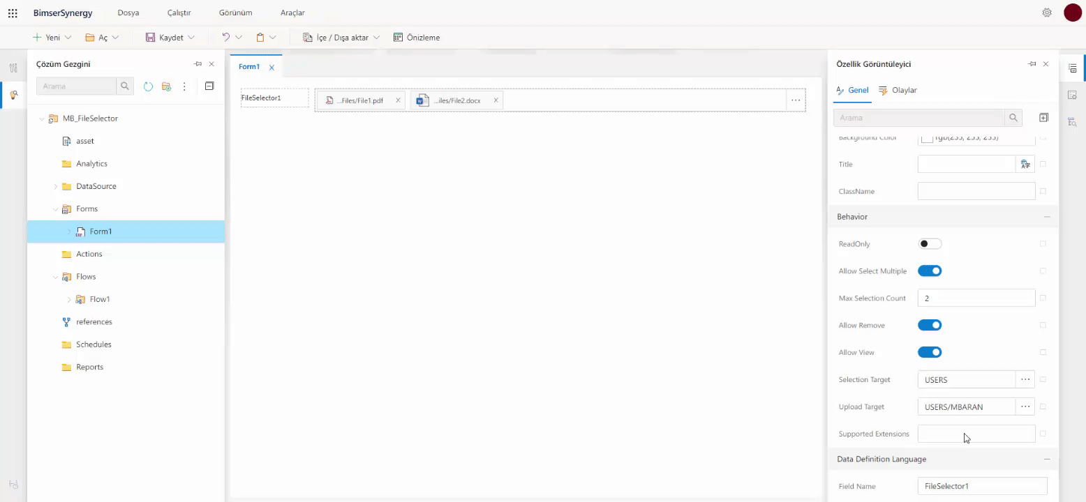
'Allow Select Multiple' - This feature that sets whether or not multi-file selection is allowed. When activated, multiple files can be selected and the Max Selection Count field becomes active.
'Max Selection Count' - The maximum number of files to be added to the object is limited to the value written in this field.
'Allow Remove' - This is the feature where it is set whether or not the added files can be removed. When this feature is activated, the added files become removable.
'Allow View' - When this feature is activated, it is ensured that the attached files can be viewed when clicked on.
'Selection Target' - When you want to add a document to the object via document management, the user is first directed to the folder selected in this field.
'Upload Target' - The area where the file path where the files attached to the object will be saved.
'Supported Extension' - This is the area where the extension information is selected for the attached files. It is ensured that the files to be added are only in the extension types selected in this field.
Data Definition Language
'Field Name' - The field in the database of the system that determines the name of the column it will create for the object. In the "Name" section, the object can be given another name and the column name to be created for the object in the database table can be created as a different name.
Events
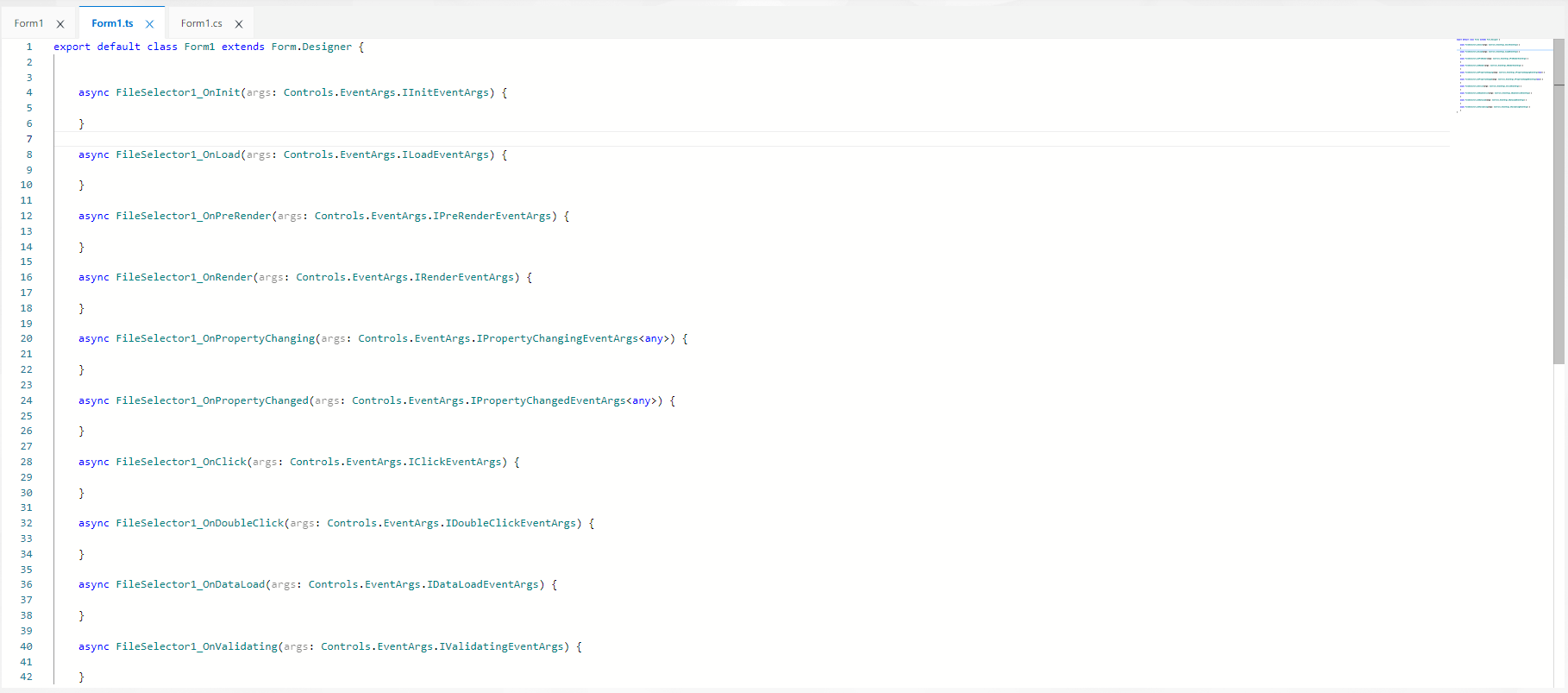
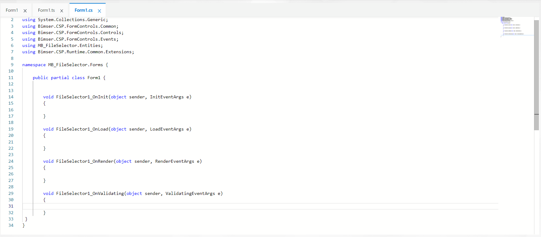
The events owned by the object are located in the "Events" tab in the Property Viewer panel. Each event is triggered at different runtime moments, performing its own unique operations. Code written by the developer to these events is also executed at the time the corresponding event is triggered.
When the events in the "Client" field are double-clicked, the screen is directed to the form code editor section called "Formedi.ts" where TypeScript coding can be done and the method block for the clicked event is automatically created.
When the events in the "Server" field are double-clicked, the screen is directed to the form code editor section called "Formadı.cs" where C# coding can be done and the method block for the clicked event is automatically created.
The developer can construct any code block within these methods. Next to the event whose method is created on the code side by clicking from the Events tab, the method name information is automatically generated and the relationship between the event and the method is specified.
Formed methods;